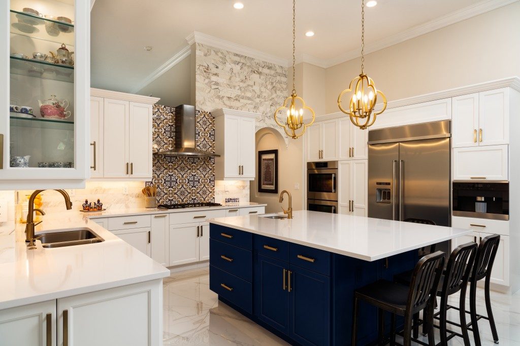
Good interior design feels like it’s based on a trained eye or an aesthetic preference alone, but once you pour yourself over magazines, you’ll know that this art is full of rules. Do this. Don’t do that. Use this. Ditch that. The thing about design is, it evolves so fast. What could be good three years ago may not be what’s Instagram-acceptable today. That said, in this article, we’ll try to unpack these rules and determine if they’re worth ‘copping’ in your home design or ‘dropping’ altogether.
Don’t use bright colours in the bedroom.
The answer? Cop! You should follow this rule in your design. Colours, as you know, play such a significant role not just in the aesthetics of the space, but in the mood of people. In general, warm, bright hues trigger a sense of activity, say, movements or conversations, while cool, subdued tones create an atmosphere of relaxation. In the bedroom, an area in which mood is imperative in making the space functional, hues are elements you should consider first in your priority list, and they should be — as you guessed it — cool, subdued shades. If you want to really can’t do away with bright colours and you need to have your favourite reds and yellows, use them as accents only. Or, go for pastel versions of such hues.
Do match finishes.
Drop! Yes, this design move makes for a coherent space. It ties the entire room together and creates continuity throughout. But when you have the same wood finishes in every corner, your space will instantly appear one-dimensional. In short, it will look flat. So rather than matching finishes, mix them up. In doing so, one thing you should take note is the undertones, the colour temperature. As long as your materials share the same undertones, you need not worry about not achieving a coherent-looking room. Do remember that undertones can be cool, warm, or neutral. Consider this when shopping for your floors, cabinets, and even your console table. Singapore-based interior designers can help you determine which finishes mix well.
Don’t use dark colours in tiny rooms.

You won’t believe this, but you need to drop this design rule. This is not just an outdated guideline, but a false one, at that. The age-old notion is that heavy colours in small spaces will make it smaller further. But the thing is, dark tones can increase the depth of a tiny room, which gives the illusion of expansiveness all the same. It will trick the eye, not being able to see where the walls begin and end. But if you’re anxious about painting surfaces with dark hues, use metallics and install lots of mirrors to make sure that the room becomes bigger.
Do place small furniture in small spaces.
No, this isn’t a trick question. But if you were tricked, sorry, but the verdict is… cop! You should observe this cliché rule because it uses the basic design principle of scale. This means that the size of one element should match another, as well as the location it’s placed at. So small rooms require small furnishings, while large rooms entail large furnishings. Otherwise, a tiny space gets even tinier when paired with big pieces, while a huge space becomes more overwhelming when filled with too-small pieces. The only exception to this rule is when you’re trying to create a certain vibe in the space. For instance, a small space-big furniture works when you want to have an intimate atmosphere. Similarly, a big room-small furniture can be good if you’re going for a minimalist look with so many negative spaces.
Design Rules, Unpacked
In interior design, some rules are worth following, while some are okay to be buried into oblivion. Now that you know better, go make some magic on your home design.

