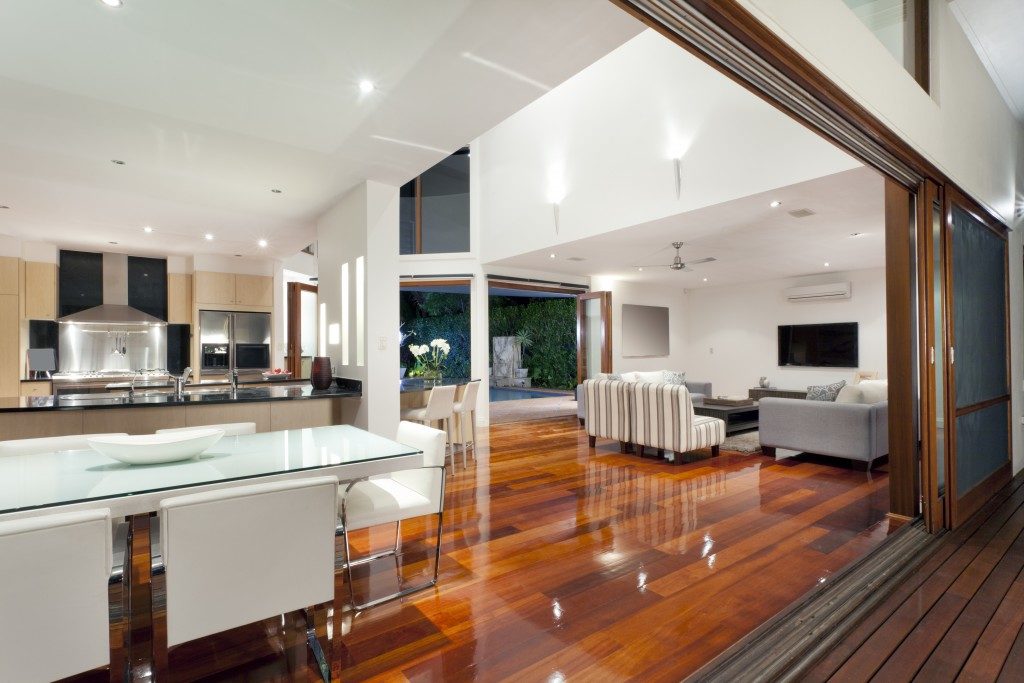
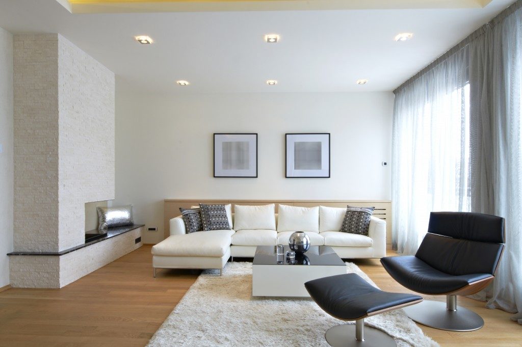
It’s okay to jump into trends, as long as they aren’t the backbone of your interior design. Otherwise, you’ll end up with countertops and tiles that look hideous, two or four years from now. Remember that the key to a timelessly beautiful space is sticking to basic interior design principles. As you enhance your space or decorate your new home, remember these things:
Rule of Three
In design, objects grouped in odd numbers are more aesthetically pleasing. They look natural, not staged. Thus, they’re not too formal or cold, the very atmosphere you want in your cozy home. Hence, apply the rule of three in different aspects of the design. In the color palette, for instance, pick a dominant hue, a secondary one, and an accent. Distribute them in a 60-30-10 proportion. In terms of texture, incorporate the classic triad of metal, glass, and wood. If you’re doing a significant overhaul of your home, you can consider tinkering with its built-in features, like the windows. In Kansas City, interior designers recommend having three small windows opposite a bay window to achieve visual variety. The principle is to arrange things in threes to make them look more natural.
Focal Point
The concept of emphasis in interior design shouldn’t be absent in your home. Something should grab people’s attention instantly when they step into your living room or kitchen. You must make a good impression and hide the eyesores. Fortunately, in many cases, a focal point already exists in a space, and it’s just a matter of highlighting it. Some built-in focal points are windows with great views, dome ceilings, and fireplaces. If you have these at home, you only need to arrange your furniture near these elements or give them a pop of color to emphasize them. In case you don’t have these features, create your focal point. Paint the farthest wall with a bold hu or place an art piece in the corner where the eyes usually land.
Negative Space

Homeowners think of many things when designing homes. But sometimes, you should think of what to remove and which to edit out. Negative space, that empty corner in your living room or that blank wall in your hallway, is just as important as positive space. It gives people a break from interior design details. It prevents visual clutter. So how do you incorporate negative space? Ignore the urge to jump into the accents early on. They’re pretty, you have to focus on the functional pieces such as the sofa in the living room and the long table in the dining area. If you can find double-duty pieces, buy them to save space. If you’re already at the finishing touches of your design, then it’s just a matter of editing stuff. Ask yourself what each element does to a specific space. If it doesn’t add anything of value, toss it out. And make way for negative space.
Overall, it’s nice to go join the bandwagon, but it shouldn’t be your primary game plan when it comes to designing your home. The basics are your primary strategy. Apply these timeless principles to achieve a timelessly beautiful home.

