Sometimes, despite having a beautiful, visually pleasing space, you still can’t help but have this decorating itch. More often than not, it comes from a feeling of overfamiliarity with the place, when the home design starts to get a little dull and bland. But what exactly do you change in an already-pretty home, right? Well, there’s a lot you can do. From the room layout to accessories, you can switch things up and give your room a revamped look.
A New Orientation
One of the simplest ways of re-dressing your design is to rearrange the furniture placement in the room. Even swapping the positions of your long couch and mini sofa can make a big visual difference. So how do you pull this off? One good trick is to find a new focal point. That’s where you redirect the furnishings. If all these years, the fireplace has been the star in your room, perhaps it’s time to give the spotlight to your customized window. San Diego-based interior designers explain that this will not just highlight excellent views but also elongate the line of sight, which adds to the visual appeal. One thing you should remember, though, when rearranging furniture is making sure that the natural pathways are still clear. Otherwise, your new layout won’t work for you in the long run, and you might just find yourself rearranging the furniture back to its old look. Anticipate people’s movements in each corner of the room so you’ll be able to map out the traffic flow.
Ornaments on the Surface

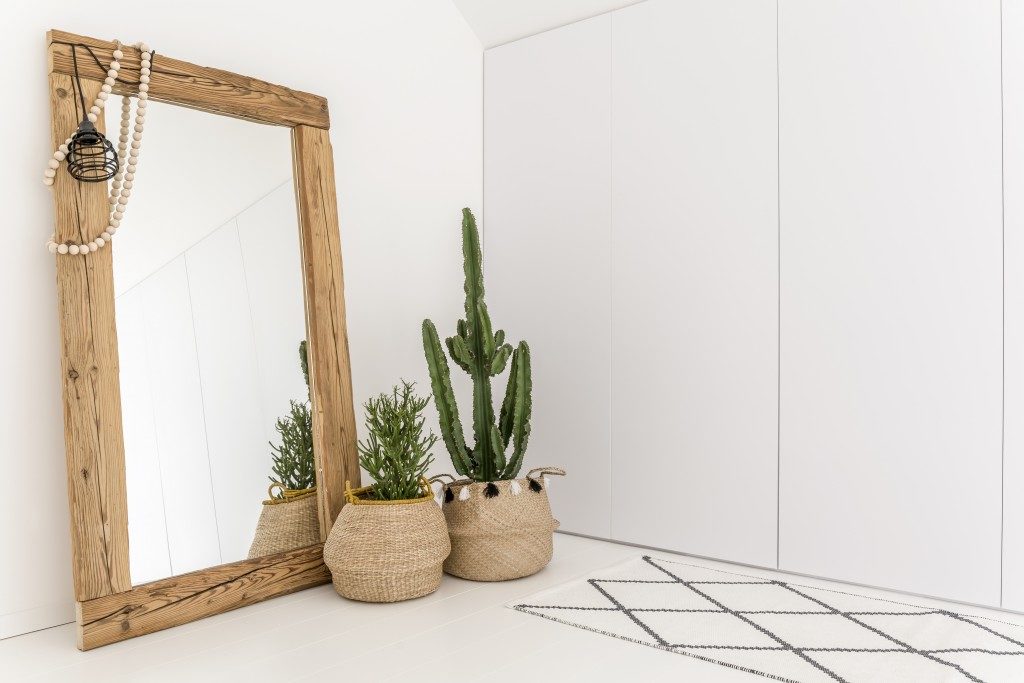
Aside from rearranging furniture and tweaking the layout, you can also adorn surfaces to give your space a new flavor. Those empty coffee tables, floating shelves, and kitchen islands are perfect for accessories. Now, which decor items exactly do you put? For one, you can place vertical-shaped objects, such as candlesticks, vases, or books. You can also go horizontal, like trays or table runners. Of course, there’s also the option to put ‘life,’ say, mini indoor plants. Vary your ornaments with these three options. After deciding which to put, remember the golden rule in accessories: group them into three’s. Odd-numbered groupings are more visually appealing because they don’t look staged. Three is a perfect choice, because one’s too little, while five and seven are too much.
When Less is More
Sometimes the decorating itch to scratch isn’t filling up the room with more stuff, but actually, taking some things out. Unfortunately, a lot of homeowners rarely think of editing as designing. They realize later on that there are too many things vying for their attention that it becomes visual chaos. Here’s the truth: you need negative space in your design. That blank wall or empty corner gives rest to people’s eyes, while also allowing other elements in the room to stand out. So think negative space when changing the look of your room. Scan the space, and for each corner in the room, find pieces that you can do away with: an artwork, a potted plant, or furniture. Ask yourself, if I toss this out, will the design still look okay? If it does, then remove it. If it doesn’t, and it’s a key element in the space, then keep it.
Revamp Your Space
Have you outgrown your home design that it only looks dull and bland to you? Go revamp the look by rearranging furniture, embellishing surfaces, and editing things out. Discover the great visual difference.

